flex 布局可以很容易实现内容完全居中。但如果内容较多,会出现挤压或显示不全的问题。这与“内容居中并滚动”的需求是不符的。这篇文字就是解决这个问题的。
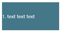
首先,实现 flex 布局并垂直居中滚动。
<style type="text/css" media="all">
  .container {
    width: 200px;
    height: 100px;
    display: flex;
    flex-direction: column;
    justify-content: center;
    overflow: auto;
    background-color: #478;
    color: white;
  }
</style>
<body>
  <div class="container">
    <p>1. text text text</p>
    <p>2. text text text</p>
    <p>3. text text text</p>
    <p>4. text text text</p>
    <p>5. text text text</p>
    <p>6. text text text</p>
    <p>7. text text text</p>
    <p>8. text text text</p>
    <p>9. text text text</p>
    <p>10. text text text</p>
  </div>
</body>
当 p 元素只有一个的时候,居中。多个的时候,滚动。
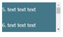
问题来了。多行文字虽然可以滚动,但内容显示不全。
为了解决这个问题。可以在内容外面加一层 div,让内容在中间这个 div 里面滚动。
<style type="text/css" media="all">
  .container {
    width: 200px;
    height: 100px;
    display: flex;
    flex-direction: column;
    justify-content: center;
    background-color: #478;
    color: white;
  }

  .content {
    overflow: auto;
  }
</style>
<body>
  <div class="container">
    <div class="content">
      <p>1. text text text</p>
      <p>2. text text text</p>
      <p>3. text text text</p>
      <p>4. text text text</p>
      <p>5. text text text</p>
      <p>6. text text text</p>
      <p>7. text text text</p>
      <p>8. text text text</p>
      <p>9. text text text</p>
      <p>10. text text text</p>
    </div>
  </div>
</body>
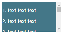
这样一来,多行文字就可以正常滚动显示了。