渐变圆弧进度条有很多实现方式。dom(为了区分,这里所说的 dom 不包含 svg)、canvas、svg 都可以。鉴于 dom 实现比较麻烦,canvas 需要写 JavaScript,所以觉得还是 svg 方便一点。
<!DOCTYPE html>
<html xmlns="http://www.w3.org/1999/xhtml">

  <head>
    <meta http-equiv="Content-Type" content="text/html; charset=UTF-8" />
    <title></title>
    <style>
      .rotate-270 {
        transform: rotate(270deg);
        transform-origin: center;
      }
      .rotate-90 {
        transform: rotate(90deg);
        transform-origin: center;
      }
    </style>
  </head>

  <body>
    <!-- 参考链接:https://www.jianshu.com/p/bfa223894867 -->
    <!-- 渐变圆弧进度条 -->
    <svg width="300" height="300">
      <defs>
        <linearGradient id="line-gradient-1">
          <stop
            offset="0%"
            style="stop-color: purple;"
          ></stop>
          <stop
            offset="100%"
            style="stop-color: pink;"
          ></stop>
        </linearGradient>
      </defs>
      <circle
        r="140"
        cx="150"
        cy="150"
        fill="none"
        stroke="url(#line-gradient-1)"
        stroke-width="10"
        stroke-linecap="round"
        stroke-dasharray="700, 10000"
        class="rotate-270"
      ></circle>
    </svg>
    <!-- 渐变圆弧进度条2 -->
    <svg width="300" height="300">
      <defs>
        <linearGradient id="line-gradient-1">
          <stop
            offset="0%"
            style="stop-color: purple;"
          ></stop>
          <stop
            offset="100%"
            style="stop-color: pink;"
          ></stop>
        </linearGradient>
        <linearGradient id="line-gradient-2">
          <stop
            offset="0%"
            style="stop-color: red;"
          ></stop>
          <stop
            offset="100%"
            style="stop-color: purple;"
          ></stop>
        </linearGradient>
      </defs>
      <circle
        r="140"
        cx="150"
        cy="150"
        fill="none"
        stroke="url(#line-gradient-2)"
        stroke-width="10"
        stroke-linecap="round"
        stroke-dasharray="360, 10000"
        class="rotate-90"
      ></circle>
      <circle
        r="140"
        cx="150"
        cy="150"
        fill="none"
        stroke="url(#line-gradient-1)"
        stroke-width="10"
        stroke-linecap="round"
        stroke-dasharray="440, 10000"
        class="rotate-270"
      ></circle>
    </svg>
  </body>

</html>
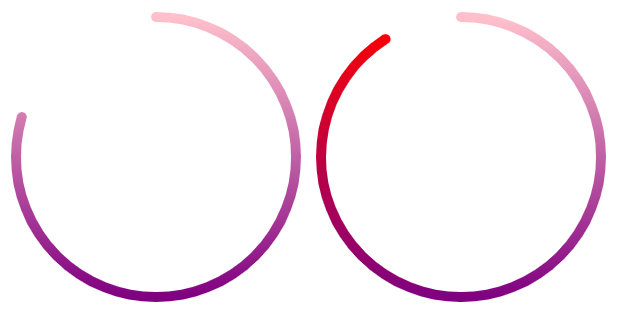
stroke-dasharray 设置的是虚线的实虚部分。将虚线部分设置得很大,避免出现第二段实线,这样就将圆变成了圆弧。
因为渐变色是从右到左,圆弧的绘制也是如此。所以将圆弧旋转 270°,使其从顶部开始顺时针旋转。
左侧的那种当进度 100% 的时候是一个颜色自然过渡的圆。其实现只需要一个 circle 元素。
右侧的那种当进度 100% 的时候是一个颜色突变的圆。其实现需要两个 circle 元素。渐变也要定义两个。右侧的进度条分成左右两个部分。左半部分的圆弧是从 purple 到 red,右半部分的圆弧是从 pink 到 purple。当进度小于等于 50% 的时候,只显示右半部分。当进度大于 50% 的分布,左半部分也绘制。其实线长度为超出 50% 的部分。然后顺时针旋转 90° 就可以衔接右半部分了。
补充:
除了使用 circle 元素外,应该也可以使用 path 元素实现。
此外,还有一种比较麻烦的方法:用无数个填充的 circle 组成圆弧部分。就像串联起来的佛珠,只不过这些 circle 相对位移较小,看上去像是一个圆润的弧。至于每个的填充颜色,需要根据圆弧开始颜色和结束颜色计算。
ps:svg 还是很有用的,学好了可以在很多场景下代替 canvas 和 dom。
2022.03.04 补充:
之前没有记录自适应 svg。现在又有这种需求了,所以补充记录一下。
<template>
  <svg viewBox="0 0 300 300">
    <defs>
      <linearGradient id="line-gradient-1">
        <stop
          offset="0%"
          :style="`stop-color: ${startColor};`"
        ></stop>
        <stop
          offset="100%"
          :style="`stop-color: ${endColor};`"
        ></stop>
      </linearGradient>
    </defs>
    <circle
      r="140"
      cx="150"
      cy="150"
      fill="none"
      :stroke="background"
      stroke-linecap="round"
      :stroke-width="strokeWidth"
      stroke-dasharray="1000"
      class="circle"
    ></circle>
    <circle
      r="140"
      cx="150"
      cy="150"
      fill="none"
      stroke="url(#line-gradient-1)"
      stroke-linecap="round"
      :stroke-width="strokeWidth"
      :stroke-dasharray="`${strokeLength}, 10000`"
      :style="`transform: rotate(${rotate}deg);`"
      class="circle"
    ></circle>
  </svg>
</template>

<script>
import { ref, toRefs } from 'vue'

export default {
  name: 'SvgLinearRing',
  props: {
    // 圆环背景
    background: {
      type: String,
      default: 'transparant'
    },
    // 渐变开始颜色
    startColor: {
      type: String,
      default: 'purple'
    },
    // 渐变结束颜色
    endColor: {
      type: String,
      default: 'pink'
    },
    // 线宽
    strokeWidth: {
      type: Number,
      default: 10
    },
    // 进度
    rate: {
      type: Number,
      default: 0
    },
    // 旋转角度
    rotate: {
      type: Number,
      default: 90
    }
  },
  setup(props) {
    const { rate } = toRefs(props)
    const strokeLength = ref(0)
    strokeLength.value = rate.value * 280 * Math.PI

    return {
      strokeLength
    }
  }
}
</script>

<style lang="scss" scoped>
.circle {
  transform-origin: center;
}
</style>
这里自适应的关键就是:viewBox=”0 0 300 300″。里面元素的数值都是相对于 300 而言的。300 是我随便取的的值,这里填什么看自己喜好,当然最好是方便计算百分比的。